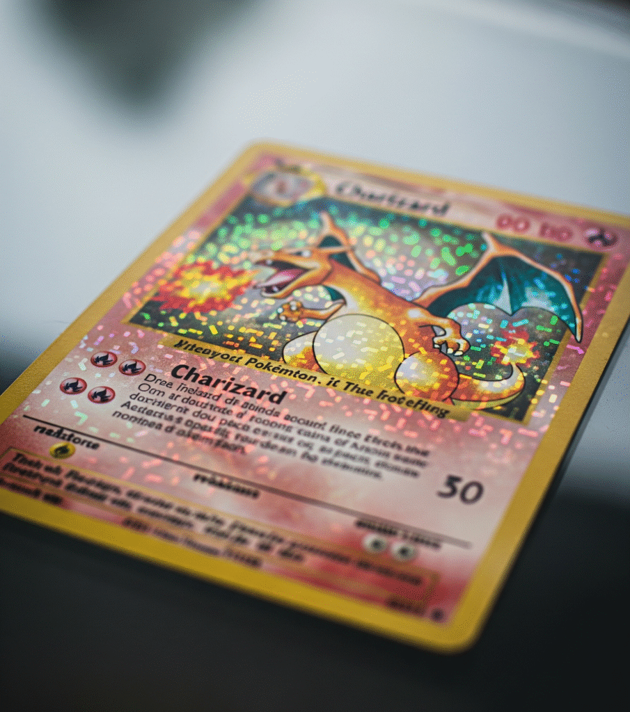
The first time I saw a Charizard Pokémon Card, it felt like holding fire in my hands. The artwork pulled me in before I even knew what the moves meant. That bright orange dragon with wings, sharp claws, and flames shooting from its tail looked like nothing else in the binder. It wasn’t just a card. It was the card.
Charizard isn’t just a fan favorite because it looks cool. It’s one of the most powerful and iconic Pokémon from the very beginning. In the Pokédex, it’s known for its Fire-Flying type, its fierce battle style, and how it flies around hunting strong opponents. First shown in Pokémon Red and Blue, Charizard became a legend, not just in games and shows, but also on trading cards.
But here’s the twist most new collectors don’t know: not all Charizard cards look the same. Depending on where they were printed, Japan, the U.S., Korea, or even China, they can look and feel different. Some have brighter colors. Some have shiny effects you won’t find anywhere else. Some are so rare, they never left their home country.
In this article, I’ll take you on a trip through Charizard card designs from around the world. Let’s explore the small details that turn a simple card into a collector’s dream.
Why Charizard Matters Everywhere
A Global Icon in Every Binder
If you’ve collected cards for even a short time, you’ve likely heard the name Charizard more than once. No matter where you live, it’s the card everyone talks about. From small stores in Japan to trade shows in the U.S., collectors all know it.
Charizard isn’t just powerful in the games. On a card, it stands for something bigger. It shows status. It brings back memories. Some kids even kept it in a plastic case just to show it off. Others traded everything they had to get one.
Sales That Make Headlines
Some Charizard cards have sold for more than houses. One copy of the 1999 1st Edition Holo Charizard sold for hundreds of thousands of dollars. Even newer cards from Japanese or Chinese sets are going up in value fast.
When prices get that high, people take notice. But it’s not just about money. These sales show how much the card means to fans around the world.
More Than a Card, It’s a Memory
Ask any longtime fan what their favorite card is. A lot will say Charizard. Not because it’s rare or shiny. But because it reminds them of a moment, maybe pulling it from a pack, or seeing it in a friend’s binder for the first time.
That feeling crosses borders. It’s the same whether you’re in Korea, China, or the U.K.. One card. One flame. A memory that never fades.
Quick Map of Charizard Pokémon Card Regional Differences
Main Printing Regions
Not every Charizard card comes from the same factory. Different places around the world printed their own versions over the years. These cards may look similar, but they’re not the same. The color, shine, size, even the feel of the card, can be different depending on where it was made.
The most popular printing regions are:
- Japan
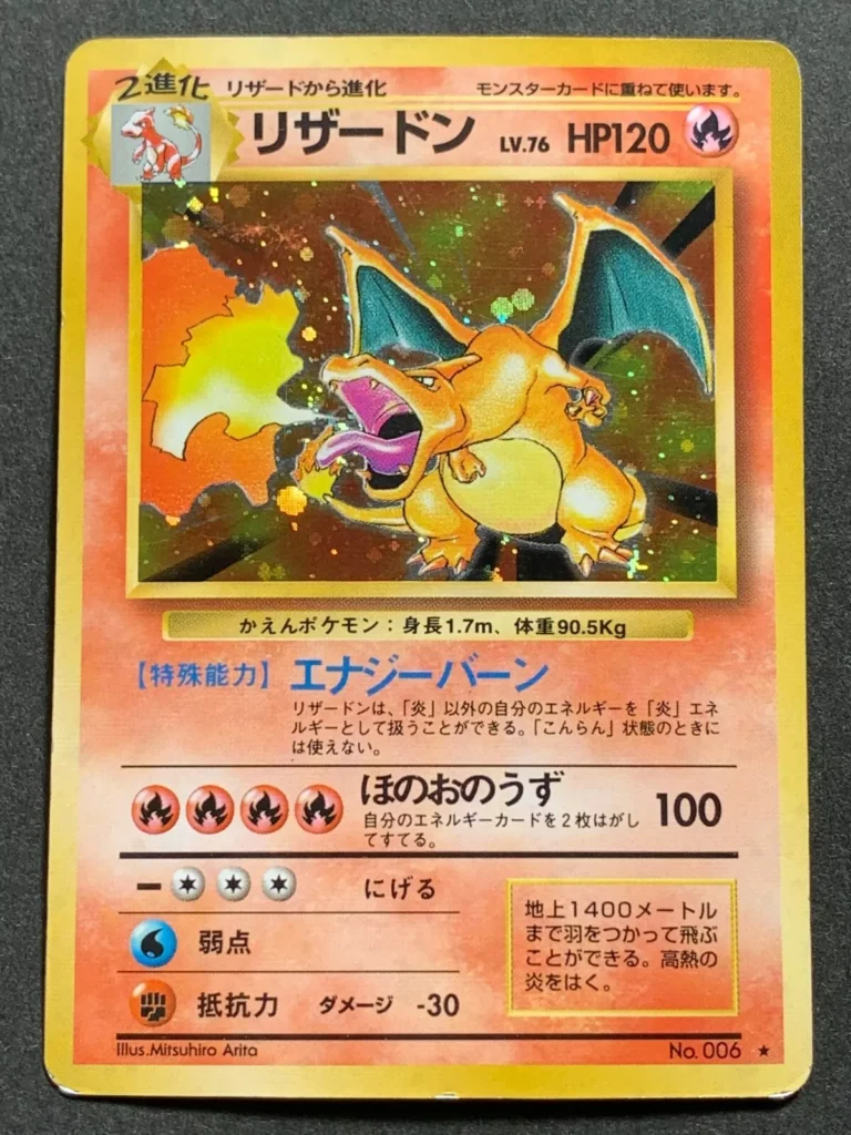
This is where it all started. The very first Charizard card was printed in 1996. Japanese cards have clean borders, sharper colors, and a special card back that says Pocket Monsters. - United States and Europe
In 1999, English cards launched in the U.S. and quickly spread across the world. These cards had yellow borders, larger fonts, and a blue Poké Ball design on the back. Most collectors outside Japan started here. - Korea and China
Korean cards came a bit later and used layouts similar to English ones. Traditional Chinese cards appeared in Taiwan and Hong Kong, while Simplified Chinese prints started showing up in Mainland China around 2020. These cards are now rising fast in collector interest.
Base-Set Era and Charizard Pokémon Card Regional Differences (1996–2000)
Card Back and Border Differences
The first cards in each region had their own unique style. What’s on the back of the card can actually tell you where it came from. The artwork, font, and even the shine can be different just by region.
Here’s a table that shows the biggest differences in card backs:
| Region | Back Design | Notable Feature |
| Japan | Pocket Monsters | Red & white with gold text |
| U.S./Europe | Poké Ball (English) | Blue border, larger logo |
| Korea/China | Follows English | Slight differences in print |
Border and Print Quality
Borders might sound boring, but they matter. Japanese cards had soft gray edges. English cards came with bold yellow ones. This simple change made Charizard look completely different depending on the card.
A few more key details:
- Japanese foil looked smoother and deeper
- Shadowless Charizard in English had no shadow around the art box
- Only English cards had a 1st Edition stamp in this era
Collectors often argue about which version is better. Some love the bright English look. Others prefer the clean finish on Japanese cards. But no matter what you choose, this era started the fire.
Neo to e‑Reader: Hidden Charizard Pokémon Card Regional Differences (2001–2003)
Barcode Stripes and Shine Patterns
This era shook things up. In Japan, many cards came with barcode stripes you could scan with a Game Boy e‑Reader. English cards had the same art, but no stripe.
And the foil styles started to branch out more. What sparkled in one country looked duller in another.
| Region | Foil Type | Barcode Present | Notes |
| Japan | Clean gloss | Yes | e‑Reader stripe included |
| English | Rougher gloss | No | No barcode, new border style |
| Korea | English-style | No | Almost same as English |
Print Quality and Centering
Collectors really noticed the print quality this time around. Japanese cards stayed sharp and well-centered. In contrast, English and Korean prints often had issues crooked borders or light print lines were pretty common.
Also, some reverse holo cards sparkled differently across regions. Even the same Charizard could shine in its own unique way.
EX and Diamond/Pearl Charizard Pokémon Card Regional Differences (2003–2009)
Special Stars and Foil Styles That Set Cards Apart
This was the era of power and sparkle. New versions of Charizard came with bold effects, rare stars, and flashy designs. Cards looked stronger and more dramatic than ever before.
One of the most wanted from this time is the Charizard ☆ card. In Japan, this card was part of a lottery. It had a silver star by the card number, which marked it as a secret rare. The English version had a gold star, and you could pull it from packs but it was still very rare.
Cards also began using new foil styles, like cosmos (starry swirls) and diamond (sharp square patterns). These changed how the card looked depending on where you got it.
Table of Differences (Charizard Cards in EX–DP Era)
| Region | Star Color | Foil Pattern | Rarity/Release Style |
| Japan | Silver | Subtle cosmos | Some lottery-only cards |
| U.S./Europe | Gold | Bold diamond/cosmos | Pulled from booster packs |
| Korea | Gold | Mixed patterns | Followed English layout |
Print and Texture Feel
This era also had texture shifts. Japanese cards had a smoother surface and better centering. English prints sometimes came with edge wear or print lines right out of the pack.
Even though the cards had the same artwork, collectors noticed the color depth and shine were better in Japanese prints. Some people only chase those versions for display.
Whether you like them for the stars, shine, or how rare they are cards from this era feel bold. And if you’re after a clean, sharp look, the region really makes a difference.
Black & White to XY: Modern Charizard Pokémon Card Regional Differences (2010–2016)
Bigger Flames, Sharper Lines
In this era, Charizard came back stronger, louder, and flashier. The artwork became sharper. The flames popped off the card. And the card powers? Way stronger than ever before.
But even with all that flash, regional design differences didn’t go away, they just changed in quieter ways.
In Japan, cards still had tighter layouts and richer colors. The text was crisp. The foil was clean. And the cut? Almost perfect. Meanwhile, English cards started to feel more commercial. The design was still great, but centering issues and print marks were more common.
The Mega Charizard EX cards really showed this off. Japanese versions had stronger holo layering and deeper blacks in the background. English versions sometimes looked washed out by comparison even though they used the same art.
Language and Layout Choices
During this time, the Korean and Chinese versions grew closer to English in layout. They used similar fonts, energy symbols, and move names. But collectors noticed they often arrived later and had fewer print waves. That made some regional versions harder to find, especially in mint condition.
This was also the first time many collectors outside Japan started picking Japanese booster boxes instead of local ones. They wanted the cleaner look, the better quality and sometimes, the rarer pulls.
Sword & Shield to Scarlet & Violet (2019–Now)
Glossy, Global… but Still Unique
Today’s Charizard cards look sleek. They’re sharper, glossier, and feel more “premium” across all regions. With sets like Shining Fates, Champion’s Path, and now Scarlet & Violet, printing has leveled up but differences still show if you look close.
In Japan, the cards have become more minimal in text, with tighter kerning (the space between letters) and smoother foil application. Text boxes are cleaner. Centering? Almost always perfect.
In English and European prints, the card layout follows the same structure, but there’s often more space between moves and energy symbols. Foil textures can feel grittier. And pull rates vary some collectors say English packs feel more “random” than Japanese ones, where secret rares show up in more regular patterns.
Art Styles Going Global
One big shift is that many Charizard artworks now launch at the same time across regions. This creates more hype, but it also makes the small print differences matter even more to collectors.
Take Charizard VMAX and Charizard UPC promos same art, but side-by-side, the Japanese prints often show deeper blacks, richer reds, and cleaner outlines. That’s why some collectors buy both versions. One for the firepower, one for the finish.
Local Releases and Print Runs
Not every country gets every set. Mainland China, for example, gets Simplified Chinese versions of selected sets, not all of them. These prints are relatively new (starting in the 2020s), so they’re modern in look but not always easy to find.
Korean cards still follow English layouts but sometimes arrive months later. That delay has made some Korean Charizard cards harder to grab after the initial launch rush.
Today, the differences might feel smaller but for a collector, they still matter. Print clarity, color tone, and how it feels in your hand… these are the little things that keep the chase going.
Why Charizard Pokémon Card Regional Differences Still Matter
Whether you started collecting Charizard cards back in 1999 or just opened your first pack last week, one thing is clear: regional differences are more than just small print quirks. They’re part of the story.
The way a Japanese Charizard gleams under the light… the bold look of an English base set… the rare print run of a Korean release… These details don’t just shape the card. They shape the hobby.
If you’re collecting for fun, follow what you like, maybe the shine, the art, or the nostalgia. But if you’re collecting for value, or for something truly special, take a close look at where your card comes from. That little detail might change everything. And maybe that’s the real magic of Charizard Pokémon card regional differences they keep the fire alive. Not just in the art or the power, but in the journey. From Tokyo to Texas, Seoul to Sydney, every card has its own path. And now, so do you.
Japanese Charizard cards often have better centering, smoother foil layers, and less cluttered text. They also use a different card back design and sometimes exclusive sets.
Yes. Value depends on rarity, print quality, and collector demand. Japanese promos and early English editions (like Shadowless or 1st Edition) are often worth more than newer or mass-printed regional cards.
Mostly. Korean cards closely follow English layouts but may arrive later and have slight texture differences. Chinese cards use Simplified or Traditional characters and are part of newer official releases in limited sets.
Many collectors feel Japanese cards offer better foil quality, fewer printing flaws, and tighter packaging standards. They’re often seen as the “premium” version for display or grading.
The English 1st Edition Shadowless Charizard is typically the most valuable. However, the Japanese No Rarity Symbol Charizard is also a major grail card, especially in mint condition.
Yes, and some collectors make that a goal. Collecting the same Charizard artwork across Japan, the U.S., Korea, China, and other prints is called a region set—and it’s a unique way to show card history.
Want a more casual but exciting card game? Try Survivor.